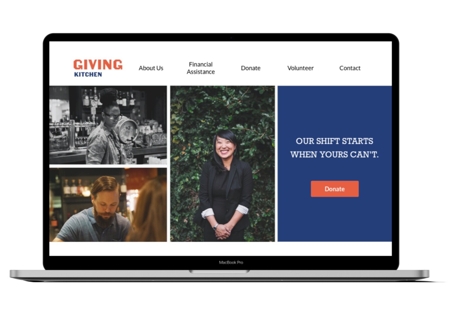
The Giving Kitchen
Donation Flow and Responsive Web Redesign for Atlanta Non-Profit
TIMELINE: One Month Design Sprint
TOOLS: Miro, Sketch, Invision, Zoom
[Concept Project]
Scroll ↓
MY ROLE:
User Research Lead - user interviews, affinity mapping, usability testing, data analysis, journey mapping
UX Design - final website mock up, website prototype
Project Summary
Working collaboratively within our remote design team, I helped develop a responsive website and improved donation flow for Atlanta based Non-Profit, The Giving Kitchen. Informed by our user research and data, our team was able to update the global navigation with clear calls to action, redesign the donation box , built trust through a reimagined donation confirmation page, and create an overall more accessible experience for mobile donors.
Discovery & Research
User Interviews
Without direct access to prior Giving Kitchen donors, we chose to recruit users who had recently donated to a cause of their choice. This allowed us to better understand what motivates users to make a non-profit donation, what their pain points within the donation process were, and what their primary needs are.
Five user interviews were conducted remotely via zoom.
User Insights
“You have to scroll too much to find anything- overwhelming amount of text"
"Support usually means you're looking for help - they have confusing menu options"
"More Likely to donate through my desktop because my credit card info is saved on there"
Synthesis
The findings from our user interviews helped us discover reoccurring paint points specifically during on the website’s donation flow.
Moving forward, we prioritized this user flow based on the insights we obtained from both user tasks, contextual inquires, user interviews, and a heuristic evaluation.
Current User Journey
To further our understanding of the donation process and in order to fully empathize with our users, we completed a retrospective user journey map.
We were looking to highlight problems the users currently face while navigating the site. This process was helpful because it also allowed us to brainstorm opportunities for improvement.
Opportunities
Currently, the global navigation button you click to get to the donation page says “Support” and we found our user becomes frustrated and distracted with this multiple-meaning language.
Since The Giving Kitchen also provides aide to service workers, you can see how the world “Support” might send a mixed message.
How might we…
How might we redesign the global navigation menus to have clearer language while also building trust in the organization?
How can we condense the lengthily amounts of scrolling while still highlighting needed information on the homepage?
Who is our user?
Our research helped us create a solid, empathetic user persona highlighting the most common needs and goals of a donor to The Giving Kitchen.
This was helpful because it provided us with a clear image of who exactly a donor to the Giving Kitchen was and what they valued.
Problem Solution
People with discretionary income, such as Janice, need a way to donate to a cause they feel passionate about without feeling frustrated throughout the donation process.
We believe that by creating a website with clear navigation, we will see an increase in donations and improved usability of The Giving Kitchen’s website.
Design Studio
To kick-start our ideation phase, we conducted a collaborative design studio session to brain storm new homepage and donation flow features. This helped us eliminate ideas that did not support the users goals and focus in on features that would most benefit our users flow and mission. We also sketched sitemaps to help develop strong information architecture and global navigation menus moving forward.
Homepage Wireframe Iterations
Before and After
highlighting three key steps in the user donation process
Usability Testing & Next Steps
We conduct four remote usability tests through zoom.
The insights from these test helped us understand which areas within our new design needed further refinement moving forward.
Key Takeaways:
users mentioned some of the text was a little small within the prototype
several users mentioned when clicking the $200 bar they also wanted it to auto fill in the blank donation box
add review page before submitting donation
Moving Forward:
Provided more time, we would like to design for expansion so that The Giving Kitchen can open up other cities for aide and donations. We would also like to focus on redesigning the application for aide user process and their mobile app experience.


